Maja Volarević
Project Manager and Content Strategist

Maja Volarević
Nov 17, 2026SaaS companies love glossaries. And why wouldn’t they? They’re easy to scale, every entry targets a “what is” keyword, and before you know it, you’ve got hundreds of definitions bringing in traffic.
At least, that’s how it used to work.
These days, Google’s AI Overviews often answer “what is” questions before anyone even gets a chance to click. And the numbers aren’t looking great. We analyzed 10 B2B SaaS glossaries and compared their traffic in October 2025 and October 2026. Six had lost traffic, two had grown, and the remaining two couldn’t be compared year-on-year.
So, is SaaS glossary still worth the effort?
To find out, we analyzed 10 B2B SaaS glossaries in seven different niches, took a closer look at 16 glossary posts, and checked their traffic, rankings, and AI citations using Ahrefs.
In this article, we’ll show you what makes a good glossary post, share a template you can use, and explain how to choose keywords you should target. We’ll also cover when to write a glossary article or a blog post, how much content you actually need, and which mistakes to avoid.
Finally, we’ll talk about getting your glossary pages into Google search results and AI answers, and share a checklist you can use before publishing.
All traffic numbers in this article come from Ahrefs, so they’re estimates rather than actual website analytics. Unless stated otherwise, the numbers cover worldwide traffic.
Here’s how we collected the data:
Keyword search volumes, clicks per search, keyword difficulty, and cost-per-click figures are based on US data from Ahrefs Keywords Explorer.
We also reviewed the glossary pages in November 2026, so some of the issues we mention may have been fixed since then.
Your glossary can do more than help you rank in Google. Your sales team can share them with prospects, marketing can link to them from blog posts, and customer support can send them to customers who need a little help with industry jargon.
But when it comes to Google traffic, things have gotten trickier.
According to Ahrefs, 99.2% of keywords that trigger AI Overviews are informational. Their research also found that AI Overviews reduce clicks to the top-ranking result by 58%, compared to 34.5% in April 2025.
And guess what most glossary pages target? Informational keywords.
So, can you still get decent traffic from a glossary? Absolutely. But publishing hundreds of definitions and hoping Google will send visitors your way isn’t much of a strategy anymore.
We picked glossaries from different B2B niches, sizes and strategies (from established ones that have been around for years to those that launched just recently). For each one, we counted entries from the hub page and XML sitemaps, audited one to three entries for structure, links, trust signals and accuracy, and pulled folder-level traffic and AI citation data from Ahrefs.
| Glossary | Entries | Entry length (words) | Est. traffic, Oct 2026 (worldwide) | Change, Oct 2025 → Oct 2026 |
| Mailchimp (email marketing) | 71+ | 1,200–1,400 | 185,000 | −48% |
| Okta Identity 101 (identity and security) | ~340 ranking URLs | 950–1,200 | 123,000 | −19% |
| DealHub (CPQ and RevOps) | 463 in sitemaps | ~6,500 (CPQ) | 89,000 | −23% |
| ProductPlan (product management) | 179+ | 350–1,200 | 64,000 | −64% |
| airfocus (product management) | 467 | 350–1,150 | 38,000 | −36% |
| Deel (HR and global payroll) | 183+ | 1,300–3,750 | 28,000 | +41% |
| Chargebee (subscription billing) | 73 | ~1,900 | 15,000 | −15% |
| Productboard (product management) | 30 | 1,300–1,400 | 10,000 | +29% |
| Oro AI Glossary (B2B commerce) | 37 | ~400 | Early stage | New |
| Core dna (DXP and commerce) | 159 | ~1,300 | ~500 | From 0 to 503 visits (no % possible) |
How we got this data: traffic and change come from Ahrefs Site Explorer, with each glossary folder entered as a path, All locations, Average volume. Each figure is Ahrefs’ monthly organic traffic for October 2025 or October 2026 (the average of its daily estimates for the month), pulled 9 November 2026. Entries were counted from each hub page and XML sitemap. Entry length is the main-body word count (±10%) of the 1–3 entries we audited per glossary, not an average across every page.
| Glossary | Strength | Weakness |
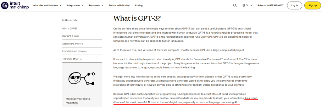
| Mailchimp | Its SEO entry is written by a named expert guest author, and entries add an AI-generated summary FAQ that answers likely follow-up questions. | Traffic depends on two pages: “email marketing” and “content marketing” bring 82% of visits. Some entries are out of date; the GPT-3 entry still treats GPT-3 as current. |
| Okta | Entries end with a list of sources, and the glossary earns a lot of traffic from keywords close to its product, such as “nonce”. | The body text has only about one link per entry to other pages, so readers get few paths onward. One entry contains a factual error about IPv6 address space. |
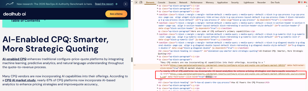
| DealHub | Entries show who wrote them, who reviewed them and when they were last updated. The CPQ entry links to about 38 other entries. | Leftovers from AI drafting are still live, such as links tagged “utm_source=chatgpt.com”. The CPQ entry cites a 2018 report. The hub claims 1,000+ terms, but its sitemaps list 463. |
| ProductPlan | It wins terms that competitors also target: #2 for “what is a backlog”, where airfocus ranks #9. Headings are phrased as questions, so answers are easy to find and quote. | A “See also” link on one entry opens the wrong page. Some entries drift away from product management. |
| airfocus | Terms are grouped into 6 categories, and every entry has a table of contents and an FAQ. | Half of its 467 glossary pages get fewer than 10 visits a month. It’s worth checking whether those pages justify the work that goes into maintaining them. |
| Deel | Entries link to Deel’s product pages and case studies, so a reader can move from a definition to the product. | 42% of glossary traffic goes to two pages found by searches for Deel’s own brand (“deel login”, “deel careers”). Compliance entries show no date, so readers can’t tell whether they’re current. |
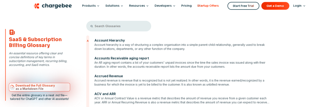
| Chargebee | The whole glossary is offered as one Markdown file that readers can load into ChatGPT or other AI assistants. | The MRR entry went live with an editor’s note still in the text, and 8 of its links point back to the same page. |
| Productboard | Only 30 entries, each with original diagrams. It earns among the highest AI citations per entry in our sample. | Some topics appear twice, in the glossary and on the blog (for example “What is MVP”) potentially competing for the same keywords. |
| Oro AI Glossary | 37 terms focused on AI in B2B commerce, a new topic with few established competitors. | Launched too recently to judge how it performs. |
| Core dna | Entries show when they were last updated. | The same entries are also published on a sign-in subdomain, creating duplicate copies. Entries have almost no links to other pages. |
This table covers eight glossaries in our sample. Oro and Core dna are not included in this comparison.
| Glossary | Top entry | Position for its top keyword | Est. visits / month (single-day, worldwide) | Term type |
| Mailchimp | Email marketing | #2 (“email marketing”) | 216,072 | Core |
| Okta | Nonce | #10 (“what is a nonce in security”) | 18,709 | Adjacent |
| ProductPlan | What is a backlog | #2 (“what is a backlog”) | 10,023 | Core |
| Deel | Employee portal | #3 (“deel login”) | 6,487 | Branded |
| DealHub | Business proposal | #8 | 4,599 | Adjacent |
| airfocus | Content marketing roadmap | #2 (“what is a content roadmap”) | 4,304 | Adjacent |
| Productboard | Competitor analysis | #7 | 3,619 | Adjacent |
| Chargebee | Recurring payments | #4 (“recurring payments”) | 2,744 | Core |
How we got this data: Ahrefs Site Explorer’s Top pages report for each glossary folder, All locations, Monthly volume (Ahrefs’ default), single-day estimate for 3 November 2026. These page figures come from a different Ahrefs view than the October monthly totals in the first table, so the two can’t be compared directly. On 3 November, the same view estimated the whole Mailchimp glossary at about 300,000 visits, so the email marketing page accounted for more than two-thirds of it. “Position” is the page’s best Google ranking for the keyword that sends it the most traffic. “Term type” is Quoleady’s judgment of how close the term sits to what each company sells.
Among the eight glossaries included in this comparison, only three (Mailchimp, ProductPlan and Chargebee) get the most visits on an entry about something the company actually sells. For the remaining five, the top page covers a nearby topic, like Okta’s “nonce” or airfocus’s content marketing roadmap, or attracts searches for the brand itself, like Deel’s “deel login”.
Those pages can bring in plenty of visitors, but few of them are looking for the product. So a big traffic total doesn’t tell you how many potential buyers a glossary reaches. Before you report your glossary’s traffic, check which pages bring it in and whether those visitors are likely to buy.
We analyzed 10 glossaries, but only eight had comparable year-on-year percentage data for October 2025 and October 2026. Six of those eight lost estimated traffic. Oro was too new for this comparison, while Core dna grew from a zero baseline, so no percentage change could be calculated.
To check whether that was just a quirk of the glossaries we picked, we also looked at two large, well-known glossaries outside our sample: Optimizely’s Optimization Glossary (−36%) and Cloudflare’s Learning Center (−3%).
Both declined too, Cloudflare only slightly, so the drop isn’t limited to our sample. ProductPlan and airfocus, two of the largest glossaries we analyzed, saw some of the biggest traffic losses.
Two of the eight glossaries we could compare year-on-year actually grew: Productboard (+29%), which has just 30 pages, and Deel (+41%), which focuses on topics relevant to its product. Core dna also went from zero to 503 monthly visits.
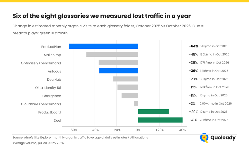
How we got this data: Ahrefs Site Explorer, each glossary folder entered as a path, All locations, Average volume. Monthly organic traffic (the average of Ahrefs’ daily estimates) for October 2025 vs October 2026, pulled on 9 November 2026. Analysis: Quoleady.
A couple of things could explain why glossary traffic dropped:
High search volume doesn’t always mean lots of traffic. Some keywords get thousands of searches every month, but very few people actually click on the results.
To see how this works, we looked at clicks per search in Ahrefs. This metric tells us how many clicks a keyword generates on average each time someone searches for it.
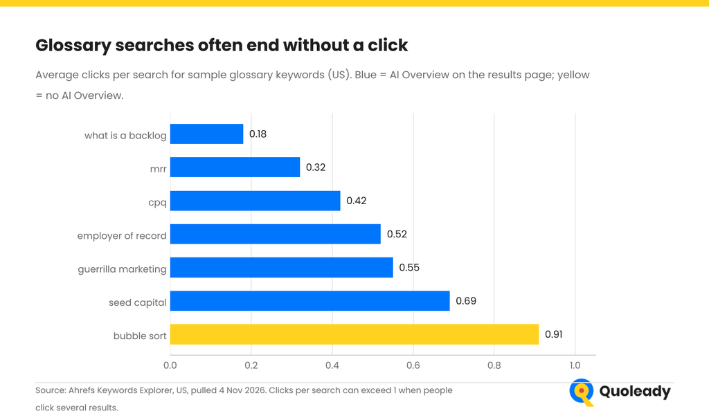
How we got this data: Ahrefs Keywords Explorer, United States, pulled 4 November 2026. Clicks per search is Ahrefs’ estimate of average clicks per search; AI Overview means Ahrefs recorded one on the US results page.
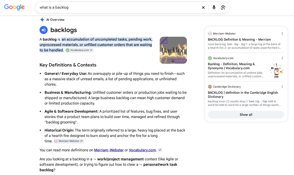
“What is a backlog” gets around 10,000 searches a month in the US, but only 0.18 clicks per search. That’s just 18 clicks for every 100 searches. Compare that with “bubble sort,” which gets 0.91 clicks per search, or 91 clicks for every 100 searches. It’s also the only keyword in our sample without an AI Overview.
This doesn’t prove that AI Overviews are responsible for the difference. But it shows why search volume isn’t enough when choosing glossary topics. You also need to consider how many clicks a keyword gets, how relevant it is to your product, and whether you have enough expertise to cover the topic properly.
We compared the glossaries by how many pages they had and how thoroughly they covered each topic. We found three different approaches, and having more pages didn’t necessarily mean better content.
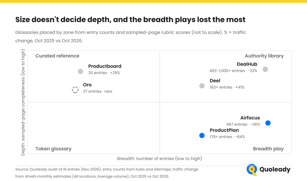
airfocus and DealHub Both have roughly the same number of glossary pages, but their approaches are very different. DealHub publishes longer, more detailed articles, while airfocus sticks to shorter definitions. DealHub also gets more than twice as much organic traffic, according to Ahrefs (October 2026).
Our rule of thumb: choose breadth only if your niche has hundreds of target keywords, and your team can QA every page. Otherwise, curate. A glossary is one of several marketing efforts competing for the same budget, and 200 thin pages cost more to maintain than they look.
The best entries we audited share a structure. Here’s one broken down, then turned into a template.
Deel’s Employer of Record entry ranks #2 for “employer of record” with about 1,330 estimated visits a month (Ahrefs single-day estimate, all locations, 3-4 November 2026).
The term is Deel’s core product, and US advertisers pay about $50 per click for it (Ahrefs Keywords Explorer), so each visit is worth a lot.
The page has only 85 referring domains (Ahrefs), so its ranking isn’t just a backlink story. It runs to about 3,750 words under 16 H2 headings, and its URL includes the term.
What it does well:
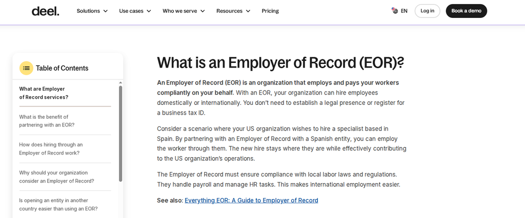
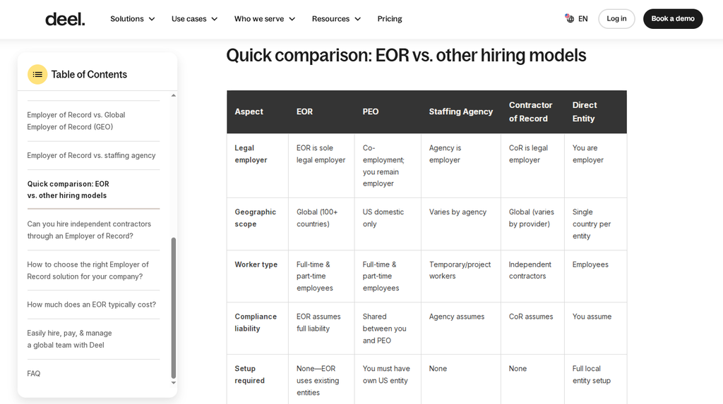
What we’d fix: Add a “last updated” date so readers know how current the compliance information is. Also, check the numbers: the page says Deel operates in 100+ countries in one section and 150+ in another.
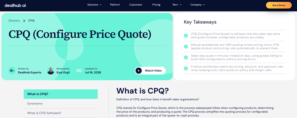
DealHub’s CPQ entry was the only page in our sample that met all 10 criteria in our rubric (below). It has an author, a named reviewer, an updated date, a 7-question “People Also Ask” FAQ and about 38 links to other entries. CPQ software turns a configured quote into a customer contract, and the entry covers the topic in more depth than any other page we audited.
It ranks #4 for “cpq” with about 2,100 estimated visits a month (Ahrefs single-day estimate, all locations, 3-4 November 2026). But it also has 1,429 referring domains, so links explain much of that ranking.
And when we checked in November 2026, it still carried five links tagged utm_source=chatgpt.com and three repeated “Consider these questions” subheadings. A complete page can still need an edit pass.
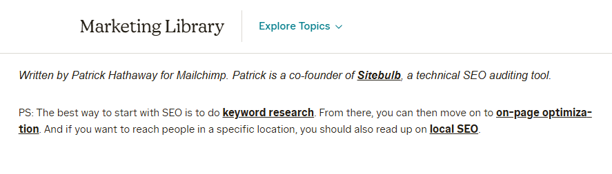
The highest-traffic page we audited, Mailchimp’s SEO entry (about 7,400 estimated visits a month, Ahrefs single-day estimate), is written by a named expert guest author. Google’s guidance on creating helpful, reliable content asks who created a page and expects a byline where readers would expect one. Only 2 of our 16 pages had one.
Productboard’s MVP article includes nine original diagrams and screenshots, along with examples from well-known companies. Meanwhile, Airfocus’s RICE article explains the framework in about 430 words but doesn’t show readers how to apply it to an actual project. That’s a missed opportunity for a topic where a worked example would be especially helpful.
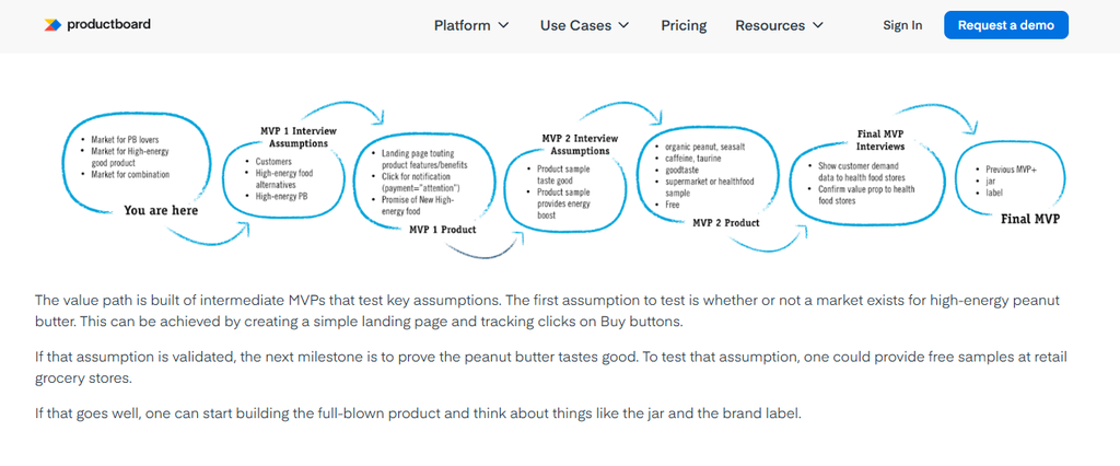
A glossary entry shouldn’t read like an encyclopedia. If you sell payroll software, your entry on SaaS shouldn’t describe software as a service as a generic software delivery model. It should explain what subscription tools change for a payroll team.
Context is what separates your page from the 50 others with the same definition.
We scored every audited page on 10 criteria. The average page met 3.2.
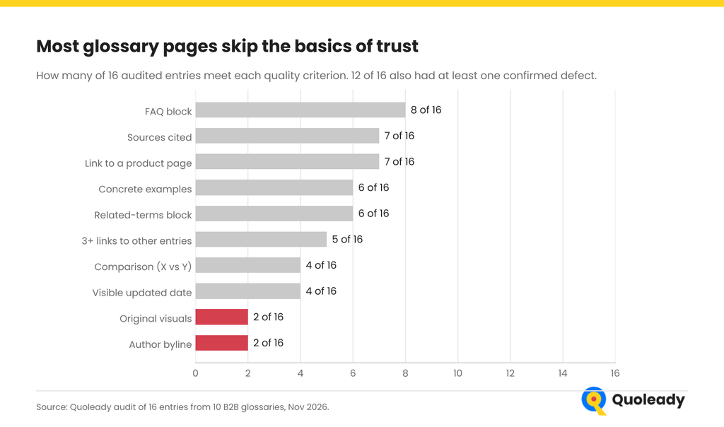
Split the fixes in two:
On FAQs: keep them, because they answer follow-up questions and give AI tools short passages to quote. Just don’t expect a rich result. Google stopped showing FAQ rich results for all sites on 7 May 2026.
The biggest difference between the glossaries we analyzed wasn’t how many terms they had, but how well those terms fit the product.
Competitors are targeting many of the same keywords
We compared the glossaries of three competing product management tools: ProductPlan, airfocus, and Productboard.
And there’s a lot of overlap.
Of ProductPlan’s 178 glossary topics starting with A–P, 131 (74%) also appear in airfocus’s glossary. Productboard has 30 topics, and 21 of them (70%) overlap with airfocus.
Some of these are fairly niche topics, like bill of materials and method of procedure.
It’s possible these companies used competitor glossaries or keyword-gap research to build their topic lists. We can’t tell who came up with which topics first, but the amount of overlap is hard to ignore.
When everyone targets the same terms, the stronger site wins:
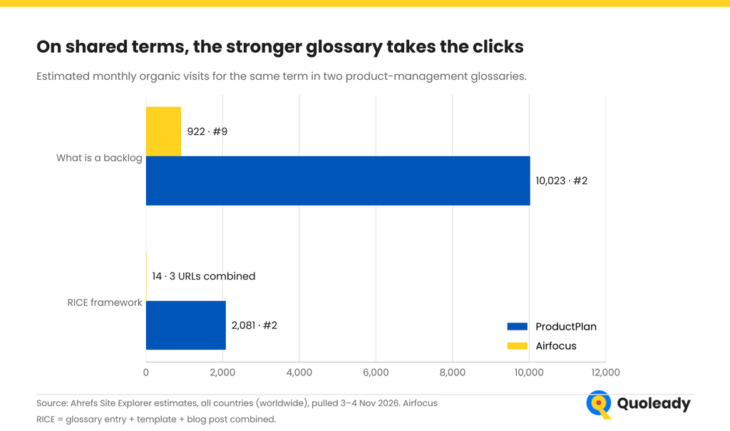
Why does ProductPlan win? The clearest difference is backlinks. About 7,281 different websites link to ProductPlan’s glossary, against 2,524 for airfocus’s: nearly three times as many (Ahrefs referring domains). The same pattern shows on other shared terms.
Both glossaries have an entry on customer acquisition cost: ProductPlan’s gets about 1,700 estimated visits a month while airfocus’s gets about 18 (Ahrefs single-day estimates, all locations, 9 November 2026).
Copying a competitor’s term list puts you in a head-to-head race with sites that may already have far more links than you.
A more extreme example is Causal, which published around 1,800 AI-generated articles using topics taken from a competitor’s sitemap. The story came out in November 2023, and Causal’s organic traffic dropped sharply soon after (Business Insider, Ahrefs).
It’s a good reminder of what can happen when you copy a competitor’s content strategy and try to scale it too quickly.
Before adding a topic to your glossary, ask yourself two questions: Would your potential customers search for this? And can you naturally connect the topic to your product?
Then sort your list into three tiers:
What’s relevant depends on your product and who you’re selling to. In our sample, we found that around 12-16% of airfocus’s glossary topics had little to do with its product, compared with roughly 8% for DealHub and 4% for Deel.
Airfocus also covers topics like seed capital, guerrilla marketing, and cost of goods sold. While these topics have some connection to product management, they’re a stretch for a company selling roadmap and prioritization software.
For a subscription billing product, almost every term about subscription revenue looks like a candidate. Here’s how we’d sort a typical list:
| Candidate term | Tier | Why |
| Revenue recognition | Core | The product automates it, so the entry can show how |
| Deferred revenue | Core | Prepaid annual contracts sit here as future revenue until they’re earned |
| Revenue churn | Core | Billing data is where it’s measured |
| Expansion revenue | Core | Upgrades and add-ons flow through billing |
| Net revenue retention | Core | Combines expansion and churn into the number investors watch |
| Gross revenue retention | Core | The same view without expansion, so churn can’t hide |
| Annual contract value | Core | Needed to price and invoice multi-year deals |
| Total contract value | Core | The same, across the full term of a deal |
| Contracted annual recurring revenue | Core | Signed but not yet live revenue, a common finance question |
| Customer lifetime value | Adjacent | Built on billing data, but owned by finance and growth |
| Customer retention cost | Adjacent | Linked to churn work, usually owned by success teams |
| Net Promoter Score (NPS) | Off-niche | A survey metric with no link to invoices |
| Sales qualified lead | Off-niche | A pipeline stage the product never touches |
| Sales development representative | Off-niche | A job title, not a billing job |
| Monthly active users | Off-niche | Product analytics, not billing |
Illustrative example: Quoleady’s tiering of a typical term list, not measured data.
Take Chargebee’s glossary, for example. Its article on monthly recurring revenue ranks #7 for “mrr,” and its most popular glossary page is about recurring payments. Both are topics someone looking for subscription billing software would likely be interested in.
Some of the most popular glossary pages in our research have surprisingly little to do with what the companies sell. For example, airfocus gets traffic from articles about APIs and channels of distribution. Even its Bubble Sort article gets around 260 visits a month, according to Ahrefs.
Okta is another interesting example. Some of its most popular glossary pages cover technical topics like 502 Bad Gateway and nonce. These pages can certainly drive traffic. The question is how much of that traffic is useful to the business.
Someone searching for “502 Bad Gateway” probably wants to fix a website error. They’re unlikely to be shopping for identity management software. Compare that with someone researching role-based access control (RBAC), a topic much closer to what Okta sells.
So before adding a topic to your glossary, ask yourself: Who’s going to search for this? Are they someone who might need your product? And is there a good reason for them to check out what you sell?
And don’t rely on keyword research alone. Talk to your sales team about the questions prospects ask. Check support tickets and customer feedback. You’ll probably find plenty of topics worth covering that you wouldn’t have thought to look for in Ahrefs.
Before you start writing, compare your keywords based on search volume, ranking difficulty, clicks per search, and how relevant they are to your product. It’s also worth checking whether Google shows an AI Overview, since that can affect how many people end up clicking through to your website.
| Keyword | US volume / month | KD | Clicks per search | AI Overview | CPC | Fit |
| employer of record | 2,700 | 16 | 0.52 | Yes | $50.00 | Deel: core |
| cpq | 11,000 | 29 | 0.42 | Yes | $10.00 | DealHub: core |
| mrr | 13,000 | 24 | 0.32 | Yes | $1.60 | Chargebee: core |
| what is a backlog | 10,000 | 24 | 0.18 | Yes | $0.02 | PM tools: core |
| agentic commerce | 6,400 | 46 | n/a | Yes | $10.00 | Oro: core |
| bubble sort | 7,500 | 25 | 0.91 | No | $0.35 | PM tools: off-niche |
| seed capital | 450 | 48 | 0.69 | Yes | $4.50 | PM tools: off-niche |
How we got this data: Ahrefs Keywords Explorer, United States, pulled 4 November 2026. Volume is average monthly US searches; KD is Ahrefs’ Keyword Difficulty (0–100); clicks per search is Ahrefs’ estimate of average clicks per search; AI Overview means Ahrefs recorded one on the US results page; CPC is the average US cost per click. “n/a” means Ahrefs had no clicks data yet. Fit is Quoleady’s judgment.
CPC gives you an idea of a keyword’s commercial value. If companies are willing to pay $50 per click, there’s probably commercial interest behind that search. Still, a high CPC doesn’t guarantee that the traffic will convert.
Next, score each keyword from 1 to 3 based on how relevant it is to your product and how likely it is to attract potential customers. Start with the topics that score high on both.
Also, check which countries the traffic comes from. Some of the popular glossary pages we analyzed rank for Indonesian searches, like “town hall adalah” on Airfocus and “streamlining adalah” on DealHub. If your customers are mainly in North America and Europe, those visits might boost your traffic numbers without bringing in many potential customers.
It depends on what people are searching for.
If someone wants a quick explanation of a term, a glossary page makes sense. If they’re looking for step-by-step instructions, examples, comparisons, or templates, a blog post or another resource page might be a better fit.
The problem starts when you create several pages answering essentially the same question.
For example, airfocus has three pages about RICE prioritization:
The blog post doesn’t link back to the glossary article, either.
Meanwhile, ProductPlan covers RICE in a single glossary article that gets around 2,100 visits a month.
Of course, we can’t say ProductPlan gets more traffic simply because it has one page. But airfocus could benefit from reviewing whether all three pages serve different purposes and linking them together where it makes sense.
We found something similar at Productboard. Its MVP glossary article gets around 146 visits a month, while its blog post on the same topic gets around 31. Both explain what an MVP is, so there’s a good chance they’re targeting some of the same keywords.
Before creating another article on a topic you’ve already covered, check what you have. Can you update the existing page? Or does the new article answer a different question that deserves its own URL?
What to do:
There’s no right number. Google’s helpful-content guidance warns against writing to a word count, and Danny Sullivan has said the best word count isn’t a thing. Google’s 2026 guide to AI features adds that there’s no ideal page length and no need to split content into small chunks.
Our data agrees:
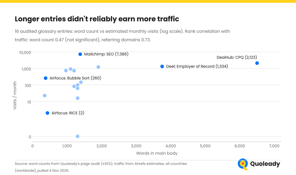
The 16 glossary pages we reviewed ranged from about 350 to 6,500 words. We wanted to see whether longer articles got more traffic.
We found no clear connection between word count and traffic (correlation of 0.47). The number of websites linking to a page had a much stronger connection with traffic (0.73). Of course, 16 pages is a small sample, so we wouldn’t draw any big conclusions from these numbers.
Airfocus is a good example of why word count alone doesn’t tell you much. Its Bubble Sort article is about 375 words long and gets roughly 130 times more traffic than its RICE article, which is slightly longer at 430 words.
Our advice: Check what the top-ranking pages cover, think about what your readers need to know, and spend more time on topics that are especially relevant to your product. Add examples, screenshots, and your own expertise where they help.
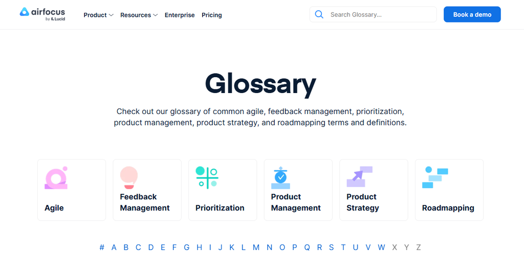
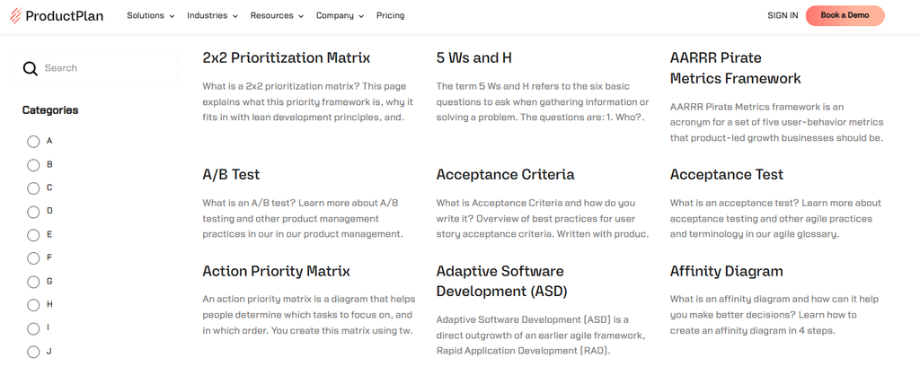
The glossaries we analyzed used two approaches: a simple A–Z list (ProductPlan, Productboard, DealHub) or an A–Z list with categories (Airfocus has six, Oro has five).
Both can work, but once you have hundreds of definitions, categories make it much easier for visitors to find what they’re looking for.
Also, make sure Google can follow the links to all your glossary pages. Google recommends using standard HTML links (<a href>). If your glossary uses expandable sections, like Deel’s, check that the links are present in the rendered HTML.
We found everything from pages with almost no internal links (Okta, Core dna, Airfocus’s Bubble Sort article) to pages with around 50 (DealHub’s CPQ article, Deel’s EOR article).
Deel is a good example to follow. Its glossary articles link to other definitions, blog posts, product pages, and case studies.
You don’t need to squeeze 50 links into every article. Just make sure readers can easily find related information and learn more about your product when it makes sense. Google also recommends internal linking as part of its SEO guidance.
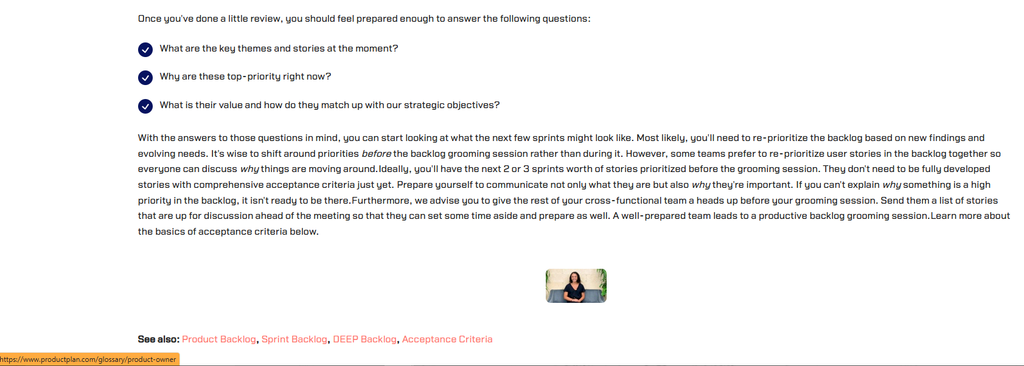
Adding a “Related terms” section can help readers explore your glossary. Just make sure the links go where they’re supposed to.
We found a mistake on ProductPlan’s Backlog Grooming article: the “See also: Product Backlog” link actually took us to a page about product owners.
Keep your URLs short, consistent, and lowercase.
For example, 93% of Airfocus’s glossary URLs start with “what-is,” “what-are,” or “what-does.” There’s nothing particularly wrong with that, but it makes URLs longer than they need to be.
Check that your CMS isn’t publishing the same glossary articles on different URLs or subdomains.
We found this on Core dna’s website. Its glossary articles are available on both the main domain and a sign-in subdomain. The duplicate pages use canonical tags pointing to the main-domain versions, which helps Google understand which pages to prioritize.
Still, if you don’t need multiple versions of the same article, there’s little reason to keep them.
If duplicates are unavoidable, follow Google’s guidelines for consolidating duplicate URLs.
Google’s spam policies define scaled content abuse as many pages generated mainly to manipulate rankings rather than help users, and Google says the policy applies whether the content comes from automation, human effort or a mix of both (Google, March 2024).
Google’s guidance on generative AI content makes clear that using AI isn’t the problem in itself. Publishing without editing is. Everything below is what we saw in November 2026.
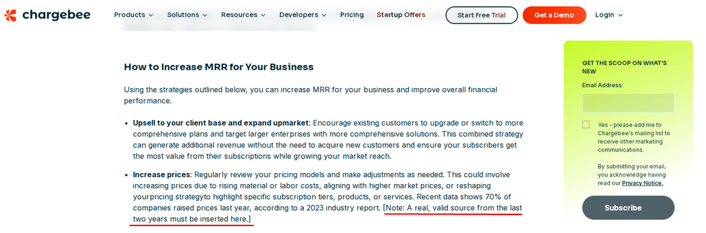
Chargebee’s MRR entry published an editor note asking for a recent source to be inserted.
DealHub’s CPQ entry had five links tagged utm_source=chatgpt.com.
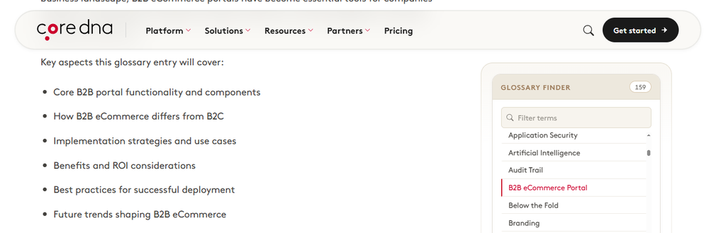
Core dna’s B2B eCommerce Portal entry included an outline preamble near the top (“Key aspects this glossary entry will cover”), and some promised sections were missing.
Fix: have a person read every AI-assisted entry before it goes live, and run three quick checks each time:
Chargebee’s MRR entry had eight body links pointing back to the page itself. Mailchimp’s SEO entry had a broken table-of-contents anchor.
Fix: crawl the glossary folder monthly.
Mailchimp’s GPT-3 entry still described GPT-3 as one of the most powerful tools available and treated GPT-4 as upcoming. DealHub’s CPQ page still cited a 2018 company report for customer results, and the references on Okta’s federated identity entry were mostly from 2007–2018.
Fix: a quarterly freshness review, starting with fast-moving topics.
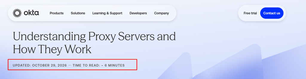
Okta’s article on proxy servers explains how a proxy sits between users and the systems they access. But we spotted a pretty big mistake.
The page, updated on October 29, 2026, says IPv6 supports “340 trillion” addresses. The correct number is approximately 340 undecillion possible addresses (RFC 4291). That’s a trillion trillion times more than Okta claims.
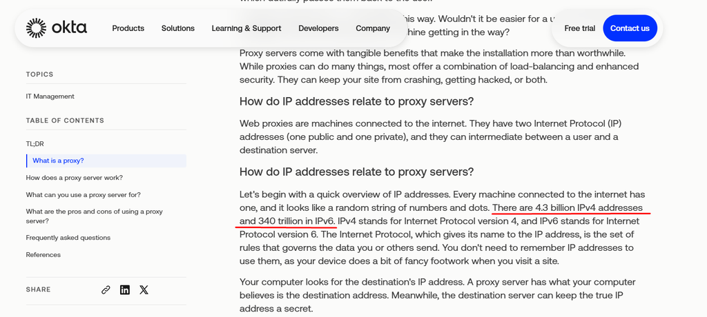
Even recently updated articles can have mistakes, so it’s worth double-checking the facts before publishing.
Fix: a subject-matter review for technical entries.
We found some unnecessary repetition in the glossaries we reviewed.
For example, ProductPlan’s Backlog Grooming article starts with a definition and then repeats the same paragraph under the heading “What is the definition of Backlog Grooming?” (checked November 2026).
Fix: Remove repeated passages and review articles that cover substantially the same information.
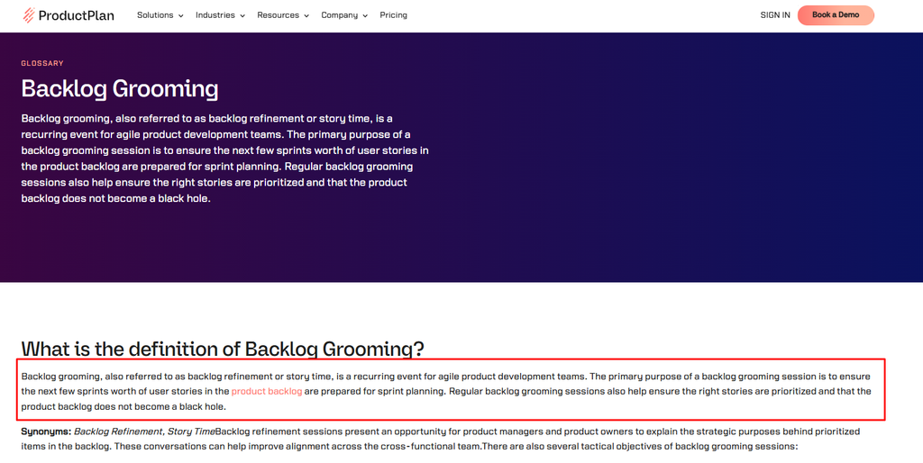
We found factual errors, outdated information, broken links, and repetitive content across the glossaries we reviewed. But we couldn’t establish a clear connection between these issues and search rankings.
For example, Chargebee’s MRR article ranks #7 for “mrr,” while DealHub’s CPQ article ranks #4 for “cpq,” despite the mistakes we identified.
Our sample is too small to determine how much these issues affect rankings. But they’re still worth fixing. Readers expect accurate, helpful definitions, and mistakes can make them question the information they’re getting.
Google made it clear in May 2026: SEO for AI Overviews and AI Mode is still SEO. Forget llms.txt, Markdown copies, special schema, or chopping content into tiny pieces.
Google wants content that offers something new. Another run-of-the-mill definition that’s already on a hundred websites won’t cut it.
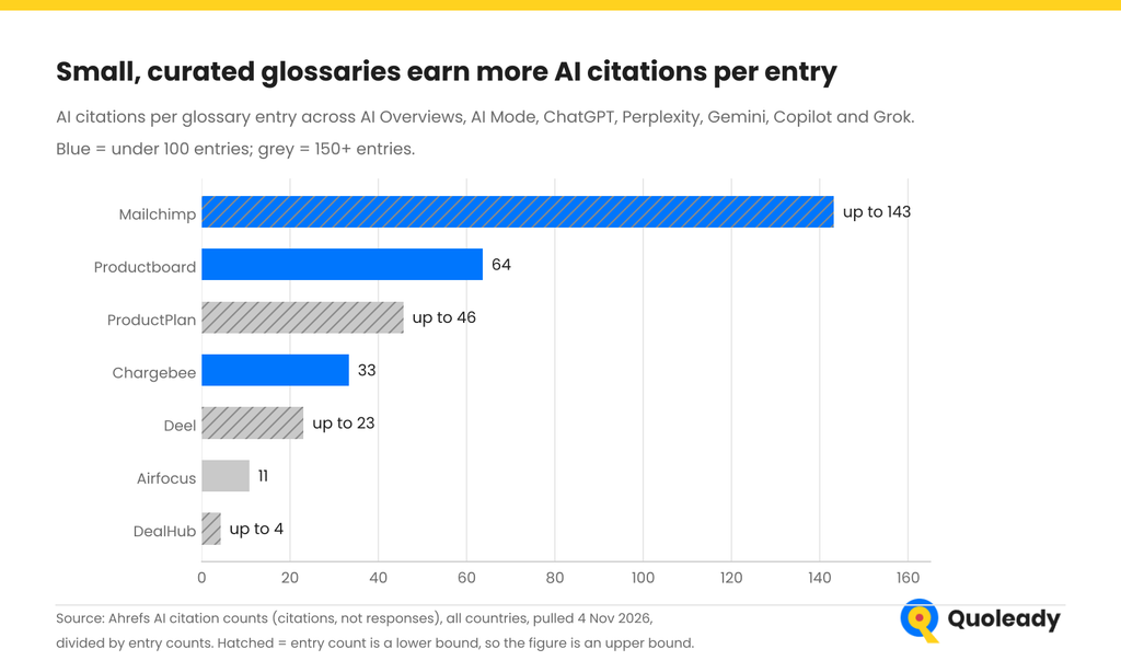
Productboard gets about a quarter of airfocus’s organic traffic (October 2026), but six times more AI citations per glossary entry. Chargebee has 73 glossary entries and gets around 33 AI citations per entry, three times more than airfocus. AI assistants have also cited 66 different pages from its glossary.
Small, focused glossaries with in-depth content seem to be what LLMs cite more often.
Traffic is nice, but at some point someone will ask how much money your glossary actually makes. And that’s a fair question.
Here’s what I’d track:
Before making changes, check your historical data in Google Analytics and your CRM so you have something to compare the results against.
And remember, SaaS sales cycles can take months. Someone might read your glossary today and become a customer six months later. If you only look at the last page they visited before converting, you’ll miss a big part of the picture.
Finally, give your glossary a regular cleanup. If an article gets no traffic, backlinks, AI citations, or leads, take another look. Maybe it needs a rewrite, maybe it belongs in another article, or maybe it’s time to let it go.

OroCommerce, a B2B commerce platform and a Quoleady client, launched its AI glossary in October 2026. It’s the newest glossary in our sample, so rather than judge it, we use it to show how the patterns in this article turn into an actual build, and what the first weeks of data look like.
The idea behind Oro’s glossary is to cover AI terms in B2B commerce while many of them are still new.
Think “agentic checkout”, “AI order processing”, and “private LLMs”. There aren’t that many good articles about these topics yet, so Oro has a chance to get its foot in the door early.
Some people looking up these topics could be also shopping around for a B2B commerce platform with AI features. And those are potential OroCommerce customers.
The glossary explains how some of these technologies work in B2B commerce and links readers to OroCommerce’s product.
The hub page has five parts:
Let’s look at how Oro’s Agentic AI article is structured. It runs to about 630 words in the main body and has these parts, in order:
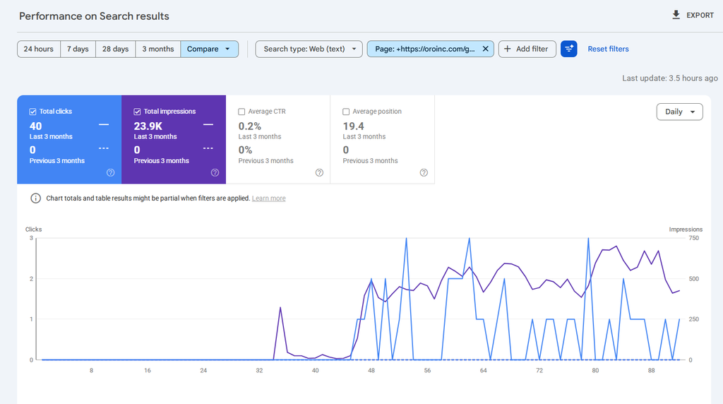
The glossary went live in October 2026, so it’s too early to judge its performance. We’re tracking its rankings, traffic, and AI citations, and we’ll share the results once we have more data.
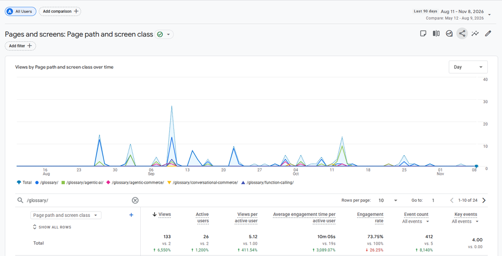
A glossary probably won’t become your biggest source of leads. But it can help people discover your brand, learn about your product, and find answers to their questions.
Before you go all in and publish hundreds of definitions, here’s what I’d check:
A SaaS glossary can still drive traffic and get your brand mentioned in AI answers in 2026. But publishing hundreds of definitions and hoping for the best probably won’t get you very far.
Look at the glossaries that performed better in our research. They cover topics related to their products, go beyond basic definitions, and give readers a reason to stick around. Meanwhile, some of the biggest glossaries have lost traffic despite having hundreds of articles.
If you’ve already got a glossary that’s gathering dust, or you’re thinking of building one from scratch, we can help.
At Quoleady, we help SaaS companies grow their traffic and visibility in AI search. We can review your existing glossary, figure out which topics are worth targeting, build an article template, and take care of writing and updating the content.
Book a call with Quoleady, and we’ll take a look at your glossary together and see where you could get better results.
Maja Volarević
Project Manager and Content Strategist
Read also



Getting your SaaS product into “best X” listicles has been a solid marketing strategy fo

Ardak Yeshniyazova
Oct 22, 2026
I don’t know about you, but these days, every time I need to find a product or service, I go to Cl

Olga Mykhoparkina
Oct 01, 2026
A SaaS company can rank well in Google and still be absent when a buyer asks ChatGPT for the best pr
Olga Mykhoparkina
Oct 01, 2026 Let us know what you are looking to accomplish.
We’ll give you a clear direction of how to get there.
All consultations are free 🔥